5.27.2010

Serene Blue

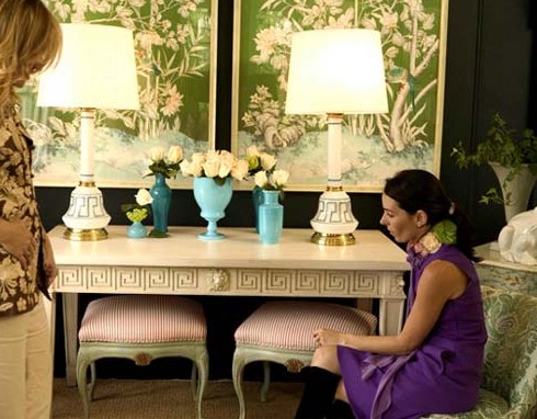
Has anyone else seen the SICO Serene Blue commercial (which unfortunately I can't find...)? It's like Nights in Rodanthe meets interior decorating. It sends a bit of a ghostly chill up my spine when I see it, but the room is beautiful. This seems to be a popular trend - pale blue and white bedrooms. Or in this case, "the room at the top of the stairs".

I've found the narrative of the commercial at least....

The room at the top of the stairs.
Full of cobwebs, books and stored memories.
Rumour was...it had its very own ghost.
We dusted off the cobwebs, kept only the books
and memories we wanted.
Then painted it blue.
Now we have a cottage at the top of the stairs.
And the only kind of spirit you'll find there,
is the sipping kind.

Ah, reads like a fine romance novel. Enjoy these gorgeous rooms.


Call Me Old-Fashioned

I think all designers and decorators have one element that keeps them passionate and inspired with what they do, be it paint colours, furniture or accessories. For me, it's always been beautiful fabrics. We are bursting at the seams at work with all of the fabric that lays around (partially because we don't return the samples...). What started as organized shelf storage has evolved into fabric in drawers, armoires and now, piled on the floor. It helps keep the studio looking artsy.

When I first started working in this field, I was astounded by the prices of fabrics. $50/yard....$200/yard....$800/yard?! Are these people crazy?! I found a Ralph Lauren pheasant-print velvet selling for $1000/yard that looked exactly like the dated fabric on my Grandma's "chesterfield". I mean really Ralph, the name only takes you so far.

But some clients are willing to pay this exorbitant amount for luxurious drapes or a custom sofa, and I must admit, most of the time it shows. A client once called to request a Morris & Co. fabric for her sofa reupholstery. As I cautiously took the fabric information, she said it was called "larkspur". I paused, waiting for the "L as in Larry, A as in apple..." to no avail, to which she blurted "LARKSPUR, LIKE THE FLOWER". Lady, I'm a young girl who considers watering a flower pot "gardening", spell the damn word. Anyways, this funny thing is a larkspur, and the chair above is covered in her fabric. Larkspur. Psh.

And to that end, I have Ms. Larkspur to thank for introducing me to Morris & Co fabrics, particularly their Pimpernel & Embroideries Collections. Traditional and detailed, I think each of these fabrics are such masterpieces that an argument has been made for skipping Fabricland and going for the real deal.


All photos courtesy Morris & Co.

5.25.2010

Better in Threes

They say all good things come in threes...

I love odd numbers and asymmetry in design. It gives the eye something to discover and wander about.

A triptych (pronounced /ˈtrɪptɪk/ TRIP-tik, from the Greek τρίπτυχο, from tri- "three" + ptychē "fold") is a work of art which is divided into three sections. (Source: Wikipedia)

I'm a huge fan of triptychs for their large size, balance of threes and ability to make a room seem even larger. Beautiful over a sofa or console, these Trowbridge triptychs are of the classic/traditional sort. For a modern approach, why not use that gorgeous landscape photo from your last trip and turn it into something one of a kind. Or shall we say, a limited edition.


All photographs from Trowbridge Galleries.

5.24.2010

Leap Year

Over the weekend, I saw the movie "Leap Year" with Amy Adams. Such a cute, romantic movie if you're in the mood for something light...


Anna (a home stager...very appropriate) sets out to Ireland with plans to propose to her long-time boyfriend on Leap Day; an old tradition from centuries ago. Of course, plans get mixed up, cute guys appear out of nowhere and romance ensues. I won't give the rest away..

As usual, I was keeping my eye on the interiors of these rustic "homes" in Ireland. Granted, these are movie sets, so I thought I'd look out for some of the real thing. The Architectural Digest kind of "real thing". Here are a few (links attached) from my search...


Granted, these aren't the typical suburban homes that surely fill Irish neighbourhoods beyond these green pastures and rugged cliffs. But apart from their luxurious appeal, I love the general simplicity of their architecture. Bright white stucco paired with jagged stonework, all set against a backdrop of rolling hills and water. It seems as though the home is less of a place for opulence, and more of a place to enjoy the land. Indeed, a philosophy for more than just minimalists.

5.22.2010

Total Inspiration

I've written many a post about my "designer idols", namely Celerie Kemble, Elizabeth Dinkle, Suzanne Kasler. I admire them for their impeccable taste, glamorous portfolios and design philosophies. I love hearing their stories about how they got there, especially funny memories and bumps along the way.

After coming across these incredible images of Ruthie Sommers' 1920s-style birthday bash, she surely sits with my growing list of Design Gods. She's a cultured and classy woman who works with L.A.'s wealthy clientele, but also volunteers so much of her talent to charitable causes. As a wife and mother of two, Ruthie has eclectic taste that has developed after years of working in New York, L.A. and (drum roll) France. This calls for a whole new category: design and life idol.

Enjoy the segments below of Ruthie's honest and humorous words, and of course, her beautiful spaces.

Ruthie Sommers' first person biography:
"Decorating really is my first love. I ‘ve been pushing furniture since Curious George. When I was reworking my website I laughed out loud reading how wonderfully chic my biography sounds. Studying art and antiques in Paris is true. But what is not mentioned is that I was there searching for a Jean Pierre and dreamt of painting everyday on the Seine. Instead the only thing I came home with was a few extra pounds and canvases of fire hydrants and hairy women.


So you may understand my need to clarify.

I have been decorating for almost eighteen years. So it is very easy to write a bio on me or any decorator for that matter. But what does “mixing eras boldly really mean”? Listing all my press, advertising how magazines I have been in makes look and sound impossibly important. I guess that is the goal in any profession. Recognition is what we all crave. I do on a daily basis.

But what makes designers different? Every bio sounds the same to me. Including mine.

So here is my deal.
My car is filled with fabric samples, old coffee cups and crumbled up paint chips. My office is not the beautiful neat organized office you may see on the pages of a magazine. The glossy white walls and perfectly p-touched folders are an illusion. I am proud of the homes I have decorated. I think they look wonderful on my website. But people live in them and there are stains on the ottoman and the peonies only make it to the mantel for the photo shoots and parties. I feel my success comes from something one can not photograph. The most fun I have aside designing sassy bars and cute powder rooms, is creating livable rooms and becoming part of someone’s family. I watch their purse carefully and in return I gain trust. And a great house is the outcome.

So . . . I am just a decorator. Big staff, great store or small garage office.. I have not changed. I have realized that my goal is not do so many things in this industry that I forget to decorate. I still schlep lampshades in my car and the highlight of my day is going downtown to check on carpentry in a old warehouse. Glamorous this job is not. However, I live and breathe to have a relationship with a home and the people that live in it. My goal is not have people remark at parties that Ruthie designed the most amazing aubergine lacquered room. But it is to hear that they were treated carefully, honestly and creatively. And that . . . is all I need."


Excerpt from 1stdibs Introspective by Susanna Salk: Sommers gradutated from the University of Virginia and moved to New York to start an apprenticeship with the renowned designer Juan Pablo Molyneaux. She then worked at Ralph Lauren Creative Services until her boss caught her and best friend Mary Mallard at a diner near the Lauren offices, laying out a design plan for their first personal client. 'Of course I was let go and cried all the way down Madison Avenue but Mary just laughed and told me this was a sign telling us to get our business license!'"

Ruthie's 40th Birthday slideshow (must see for any event planner out there!), click here.

All photo sources attached to link.

A Few Little Things...

Nothing grand. In fact, no theme at all. Just a few things I'm loving right now...

This amazing treehouse can be found in Washington, bridge and all. I would've killed for this as a kid. More amazing, youth-inspiring treehouses in this feature: 11 Amazing Treehouses.


While I love colourful interiors, my wardrobe is 95% black and white. Hence this neutral trend is right up my alley - safe and easy to wear, but so sweet and fresh.

...Speaking of fresh, I just bought a very cute nude lace dress from Joe Fresh only to find a coupon today for their summer collection. Don't make the same mistake: click here for $10 off your next purchase.

These adorable bird prints can be purchased from Art.com, and all things bird-related (so cute, like my little birdy logo) for the home are listed in this Glo magazine article.


Have a wonderful long weekend!

5.20.2010

I'll take one of everything, pleaseandthankyou.

Emerson, above, and her cute husband Ryan (below) are the most incredible couple that I can't help but share here! I've added Emerson's blog to my blog roll in case any of you are interested in following, and of course I've overloaded on pictures below for a quick looksie.


Emersonmade is their brand, and they make these adorable flower necklaces, pins and wedding accessories to order. I love the combination of vintage, J. Crew and Anthropologie influences.


Basically I'm drooling over this girl's style...more photographs to come (next time, of their amazing house!).

All photos from Emersonmade.
Related Posts with Thumbnails