A few months ago, I signed up for the
GOOP newsletter - the very chic brainchild of Gwyneth Paltrow. It's a look at the finer things in life, like 5-star hotels around the globe and trendy restaurants serving the latest raw-organic-vegan-environmental-detoxing (did I get them all?) foods fit for a queen. I particularly love Gwyneth's travel recommendations, as it lets my mind wander to locations I'd love to see and hotels I'd like to...........see the lobby of.
Hotels like
The Connaught in London, England are the ultimate design inspiration. Unlike many neutral magazines and home decorating shows, they push the envelope with colour and texture. I'm going to have to do a running commentary on this one...
Welcome to The Connaught.The curved velvet sofas, classic lamps and
incredible entertainment console....I'm in love.

Oh, Romeo...

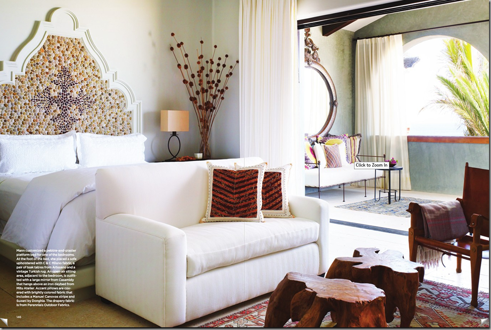
I love the sophisticated-beachy feel that this suite has. The tall beams and curtained bed frame give this room great scale, but I think I'll pass on the two psychedelic chairs.

This chair, on the other hand, is so very Celerie Kemble (note: my favourite).

I'm adding this to my
"Welcome to the Jungle" post. How did I ever forget about the sweetness of potted herbs for a kitchen?

Probably the closest I'll ever get to it...

Why thank you, Theodore.

I love the simplicity of this suite.

I love it all, including that amazing bath tub and nautical window/medicine cabinet.

The lamps are what won me over in this...

This bar and lounge area is such an unusual mix of colour, texture and pattern. I also
love this space (primarily for its gray, rather than brown, walls).

Those bar stools are a piece of art.

Theodore, I change my mind. I'll take one of these.
Oh yes, and that countertop is the most beautiful thing I've ever seen.

It's a little blurry, but isn't the finish on the fireplace stunning! If this is what afternoon tea looks like, count me in.
 All photographs courtesy The Connaught website.
Happy travels!
 I know that "investing in good china" is not something that we (the younger generation...) pride ourselves in, but after seeing the blogosphere go crazy for Target's new collaboration with Liberty of London (for example), I couldn't help but share Eloquent Ink's beautiful pieces.


