8.25.2010
I first discovered Mansour Modern's exquisite area rugs in Architectural Digest and was even more impressed once I visited their website. Despite the old design school phrase that "the ceiling is the fifth wall", I love it when interest is placed on the floor. It's like a blank canvas begging for art - the weaver's type.
Mansour Modern offers such original, bold patterns with Mediterranean, eco-friendly and tribal influences that I envision entire rooms with just the glimpse of an 8x10' rug. Although the thought of dishing out a small fortune for an area rug sometimes leaves people feeling queasy, I think that if it's approached as a piece of art (not to mention, you can pull a colour scheme from it, anchor furniture in a room and add warmth), those feelings may subside. If your husband or significant other still needs convincing, throw in the "investment" and "family heirloom" words. Or bake them some palmiers.
8.24.2010
C is for Cookie
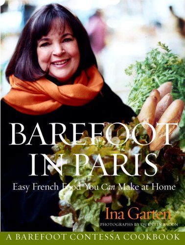
Always a dessert lover, I get such satisfaction out of trying a new dessert and tasting the sweet victory! After coming across Ina's recipe for Palmiers (otherwise known as "Elephant Ears"), I knew they'd be a good thing. Puff pastry and sugar. How bad could they be?
You know the Food Network show, "The Best Thing I Ever Tasted"? I want to go on there just to talk about this cookie. If you think you're not a baker, this cookie is as easy as it gets. And rewarding!! So tasty, so easy, so cute.........If you need friends, a raise, a car from your Dad, whatever.....I'd make them Palmiers.
Ina Garten's Palmiers
Ingredients
- 2 cups granulated sugar
- 1/8 teaspoon kosher salt
- 2 sheets puff pastry, defrosted (recommended: Pepperidge Farm)
Directions
Preheat the oven to 450 degrees F.
Combine the sugar and kosher salt. Pour 1 cup of the sugar/salt mixture on a flat surface such as wooden board or marble. Unfold each sheet of puff pastry onto the sugar and pour 1/2 cup of the sugar mixture on top, spreading it evenly on the puff pastry. This is not about sprinkling, it's about an even covering of sugar. With a rolling pin, roll the dough until it's 13 by 13-inches square and the sugar is pressed into the puff pastry on top and bottom. Fold the sides of the square towards the center so they go halfway to the middle. Fold them again so the two folds meet exactly at the middle of the dough. Then fold 1 half over the other half as though closing a book. You will have 6 layers. Slice the dough into 3/8-inch slices and place the slices, cut side up, on baking sheets lined with parchment paper. Place the second sheet of pastry on the sugared board, sprinkle with the remaining 1/2 cup of sugar mixture, and continue as above. (There will be quite a bit of sugar left over on the board.) Slice and arrange on baking sheets lined with parchment.
Bake the cookies for 6 minutes until caramelized and brown on the bottom, then turn with a spatula and bake another 3 to 5 minutes, until caramelized on the other side. Transfer to a baking rack to cool.
© 2010 Television Food Network, G.P. All Rights Reserved
8.18.2010
No Motivational Speaker Required
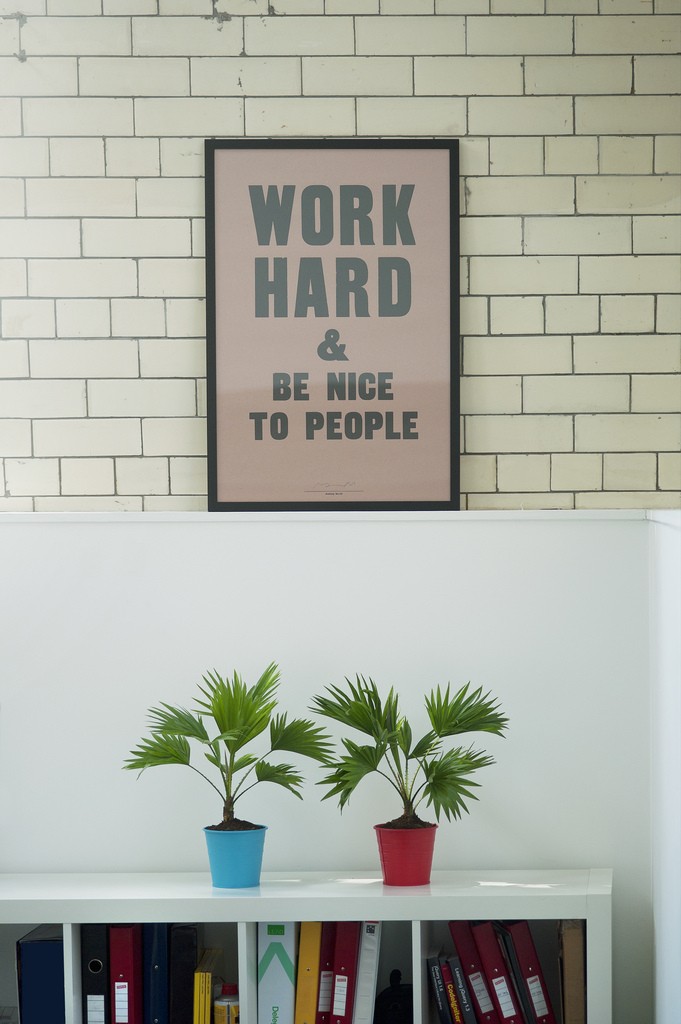
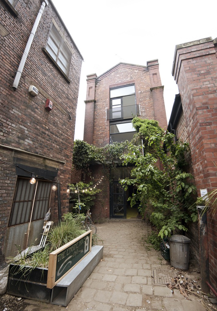
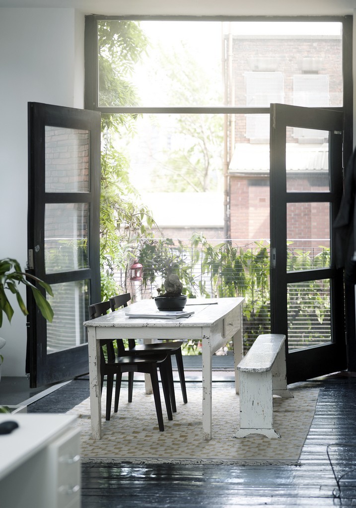
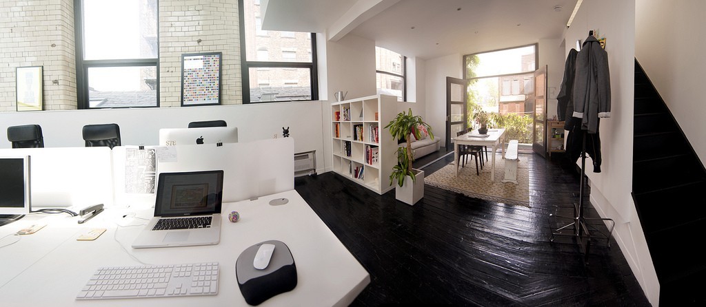
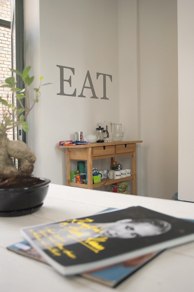
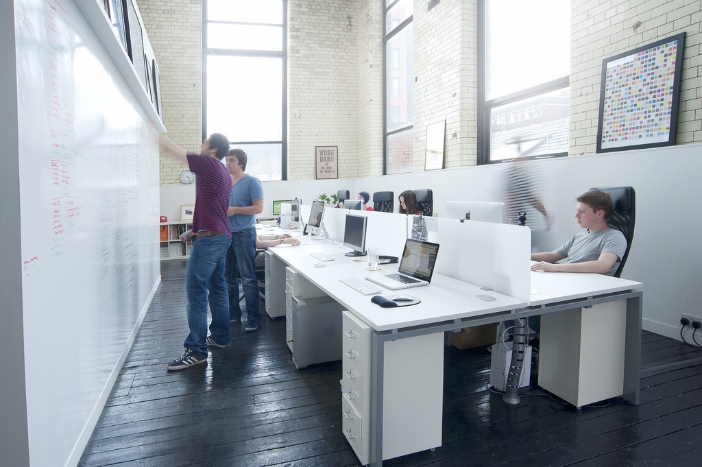
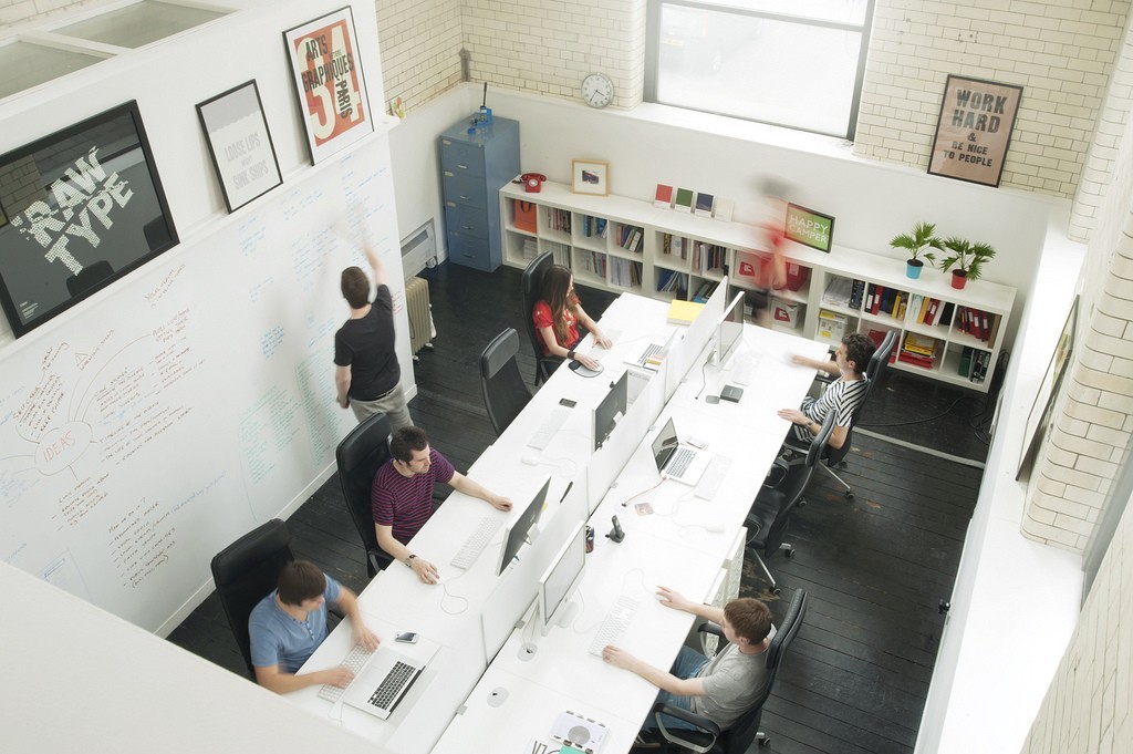
I came across this AMAZING office today and can't resist sharing it. Home of UK-based design studio Raw, these creative and talented designers get to bounce ideas around in one of the most sophisticated, interactive offices I've adored in a while.
There's a reason this type of environment really strikes a chord with me. Apart from pursuing an interior decorating career, I really believe that whether or not you're in a creative field, a positive work environment can make the world of difference in the way we work. Forget ergonomics and anthropometrics, I'm talking the balance of group privacy and togetherness, sunlight, airflow, and most importantly, that it reflect the people who work there.
Once upon a time, as an eager graduate desperate for an office job, I was hired by Team America (basically). Perched in my little cubicle, I sat for 10 hours a day with one ear covered (so I could hear the phone) looking out at a sea of heads poking over their cubicle walls. Every three months, we had a seating plan re-org......yes, like in grade 3. When I finally decided that being R2D2 wasn't for me and design was, I traded in my tiny cubicle for a gorgeous desk in a beautiful space. Beyond the hundred other factors behind my increase in happiness at work, working in this bright and open space has truly had an effect. I dress better for work, I'm happier when I come and go, and I often wonder if I'll ever be able to work in a place as pleasant as this. So take note office designers and business owners.....if you're looking to increase morale, forget the corny work conference and start with a fresh coat of paint.
More from this great article HERE.
8.12.2010
My Two Cents on Tile
For me, a beautiful back splash is composed of a geometric design and timeless material. See: mini-mosaic and glass, lattice and marble, penny dot and ceramic. What's even more inspiring is when companies like Artistic Tile make tile the showpiece of a room. This glass and carrera weave is the most amazing transitional tile I've ever seen. I want to buy a sheet of it just to have (look at, touch, drool over..).
Equally gorgeous, and I love the installation shown above!
Very Elle Decor, no?
Perfect anywhere near water. I love the movement in this piece.
Amazing back splash for that dark bar in a Manhattan apartment. Art deco? Eco chic? How about a little bit of column A and a little bit of column B.
Bachelor pad bathroom floor. Enough said.
Out-of-this-world beautiful.
I'm envisioning Morocco meets Bali.
So...how do you feel about subway tile now?